For small teams, an event app either clears chaos or adds to it. The difference comes down to clarity, timing, and a handful of choices you make before launch. If you want adoption, make your app the easiest way to get VIP info—then prove it early. Tactics like tight branding, a clean agenda, and a clear “what’s in it for me” message aren’t fluff; they’re the on-ramp to usage. If you’ve been hunting for practical ways to boost event engagement with customization secrets that save costs, start with what attendees see in the first 60 seconds.
Bizzabo puts real numbers behind the stakes: 55% of attendees say the mobile event app can make or break their experience, and 73% expect modern tech on site. That tracks with what we see daily. People want speed, live updates, and simple paths to action. Printed agendas can’t compete—which is why mobile apps for events are no longer optional.
As a Yapp Customer Success Manager, I’ve watched adoption jump 30% when organizers simplify onboarding and seed the feed with two useful posts before anyone arrives. The goal: get value on the screen in one tap. That’s where picking an event app builder with instant updates, flexible schedules, and push notifications pays off.
Here’s the kicker: time saved for your team is part of attendee experience too. When your staff isn’t stuck fixing PDFs or guiding folks booth to booth, they’re free to solve real problems and deliver hospitality. If you want space to do that, streamline event management so you can focus on what truly matters.
What kills adoption before your event even starts?
Most app drop-off happens before day one. Not because people hate apps—because they hit friction. Long sign-ins, noisy layouts, mystery menu labels, dead content. If your app feels like a scavenger hunt, folks will default to asking the info desk.
Common pre-event failure modes we see:
- Too many clicks to “the good stuff.” If the agenda, map, and announcements aren’t front and center, you’ve lost them.
- Launching late. If you announce the app the night before, you’ll spend the entire morning doing tech support.
- Overstuffed menus. A dozen top-level items looks thorough—until no one knows where to tap.
- No push plan. If attendees don’t get a helpful notification within the first hour, they forget the app exists.
Then there’s the content problem. A static schedule is table stakes. People want live changes, room alerts, and session-level details they can skim fast. They want speaker bios with headshots, not walls of text. They want maps that load in 1–2 seconds. Oh—and solid offline access because hotel Wi‑Fi has a sense of humor.
I’ve run plenty of dress rehearsals with clients the week before go-live; a 15-minute “war room” saves hours onsite. We test the download flow, scan QR codes from printed signage, and fire a sample push. If anything takes longer than a minute, we fix it.
Overcomplicating the first-time experience is the silent killer. Keep it human. One tap to the agenda. Clear labels. A short “Start here” post in the social feed. A single callout for help—“Having trouble? Visit registration or email support@yourdomain.” No guesswork, no maze.
How do small teams build an app people open daily?
Start with value in context. Show the must-knows first: agenda, room locations, and “what changed since you registered.” Then make it personal. Swoogo reports 96% of marketers see gains from personalized experiences—your app can deliver that with favoriting, custom tracks, and targeted announcements. This is where mobile apps for events earn their keep.
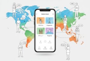
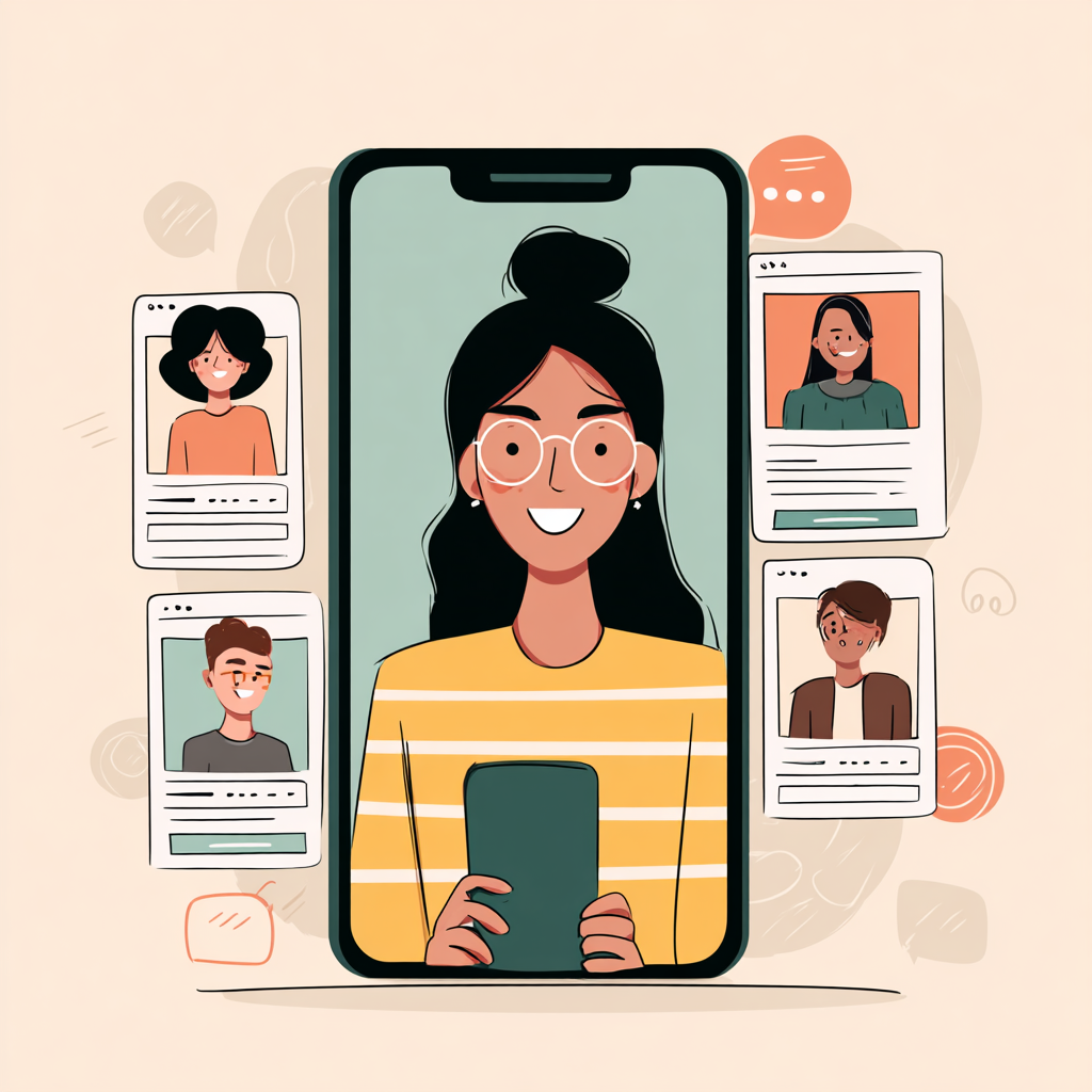
Architect for speed. Put the agenda, announcements, and map in the top row. Use plain-English labels like “Agenda,” “Alerts,” “Map,” “People,” “Docs.” Keep the agenda scannable: session title, room, time, and a one-liner. Attach speaker bios to sessions. Upload floorplans as high-contrast images. Add a People directory with headshots and filters. A few clean building blocks beat a fancy maze.
Make interaction easy—and frequent. Turn on the social feed and seed it with prompts (“Drop your best takeaway from the morning keynote”). Run a poll to crowdsource Q&A. Send 3–5 targeted push notifications per day: morning welcome, room changes, can’t-miss sessions, last-call reminders. Future Market Insights points to real-time analytics and gamification as rising levers; a simple photo challenge with a small prize drives surprising traffic.
Ship like a product, not a flyer. Set a measurable adoption goal (e.g., 80% downloads by 10 a.m., 60% agenda views per attendee). Track it. Iterate. Your event app builder should let you edit in real time and publish instantly. After shipping 200+ small-business apps, my rule is “one decision per screen”—it keeps people moving, even when they’re juggling coffee, badge, and a hallway conversation.
Steps you can run this month:
- Define the promise. “This app gives you live room updates, a smart agenda, and exclusive materials.” Put that in your first email.
- Launch two weeks out. Add the app link to the registration confirmation, website, and calendar invite. Include a QR on invoices and badges.
- Keep the home clean. Top row = Agenda, Alerts, Map. Second row = People, Docs, Sponsors. Hide the rest in “More.”
- Write for skimmers. Session titles under 60 characters. Descriptions under 140. One action per screen.
- Seed engagement. Post a welcome message, a quick poll, and a photo prompt the day before the event.
- Plan pushes. Draft your alerts the week prior: welcome, room changes, session highlights, feedback request.
- Rehearse. Do a live download test, scan QR codes on printed signs, and time the path to “Agenda.” Fix anything over 60 seconds.
Ready to make your next event better? start your trial now!